Introduction
Presented by the Filipino Organization of Concordia University Students, SHOWPAO is a celebration of the Filipino-Montreal community by providing a venue to demonstrate cultural and creative talents, as well as to promote Filipino culture to entrepreneurs, local orgs, and everyone in between.
tools used
Photoshop, InDesign, Illustrator, Premiere Pro
Keywords
Celebration, Warmth, Nostalgia
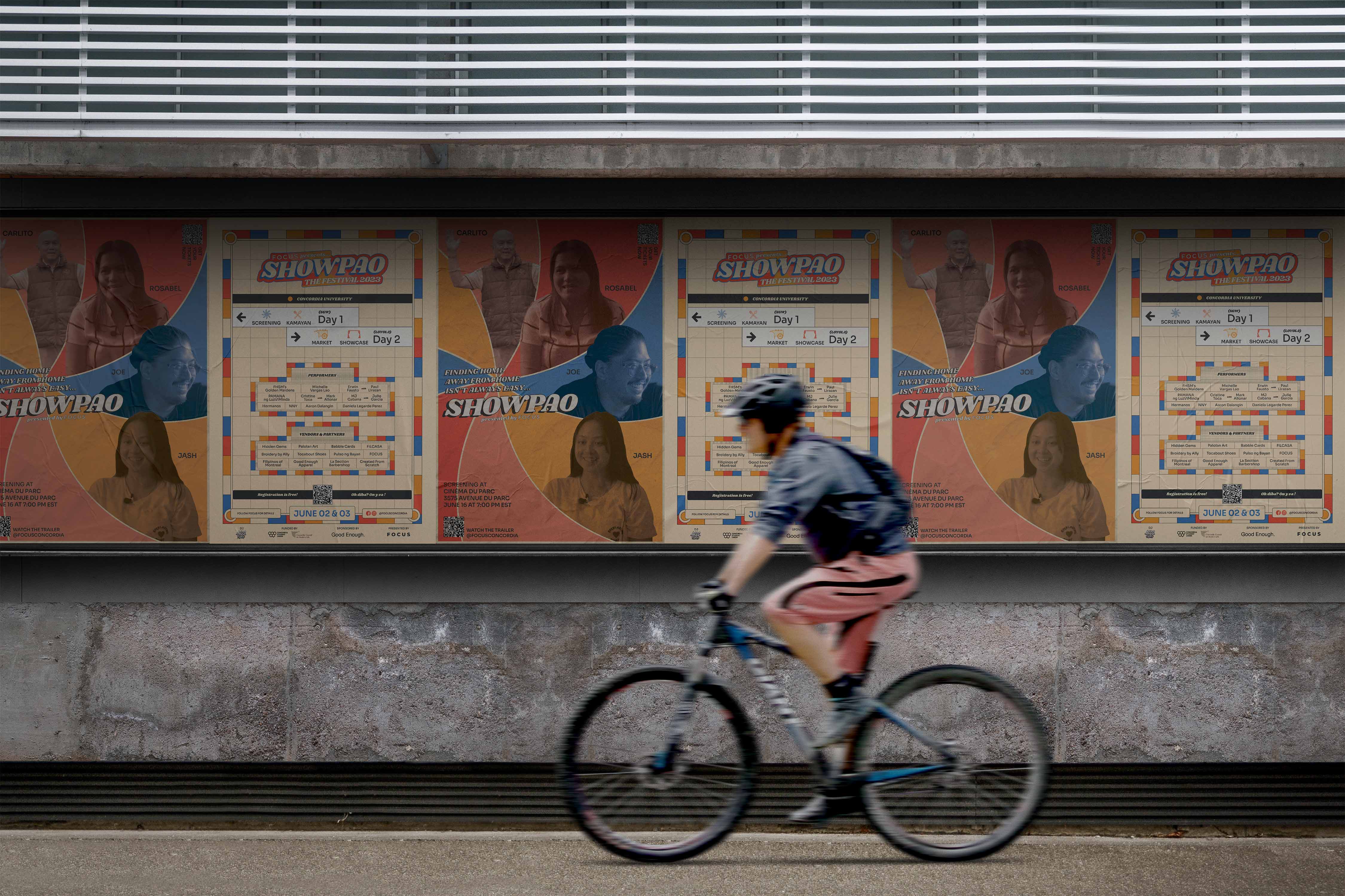
Presented by the Filipino Organization of Concordia University Students, SHOWPAO is a celebration of the Filipino community's diversity in Montreal by providing a venue for people to demonstrate their cultural and creative talents, as well as to promote our Filipino culture to entrepreneurs, local organizations, and everyone in between. SHOWPAO is a wordplay on the word siopao, a Philippine indigenized version of the Cantonese steamed bun called char siu bao. I developed their visual identity to reflect the history of the Filipino community in Montreal and the significant wave of Filipino migration to Canada in the 70s.
In 2022, due to Covid-19 restrictions, we produced and released a documentary that highlighted a multigenerational cast. Then in 2023, we presented a 2-day event that included the documentary and a talent showcase. The resulting graphics displayed an event that honored the Filipino community of the past, present, and future.
Process
As the past VP Design of the student organization, I was asked to help them create a separate branding for their annual student festival. There was no defining theme or look for the festival as the previous iterations of Showpao a decade ago was a simple talent showcase. After exploring with the team over several key themes, we chose the 70s as an inspiration not only for its distinctive design era but as a significant year in Philippine history. The warm 70s color palette was inspired by the seat colors in the Plamondon metro, its location in a neighborhood were a sizable Filipino population in the city reside.
For typography, I drew from Philippine graphic design, known for its bold and expressive character, to capture a spirit as vibrant as our culture. I designed the logo from 70s expressive typography with a wavy baseline and used big, bold and unapologetic typeface, Shrikhand, in an all-caps type treatment reminiscent of Filipino advertisement still visible today. In collaboration with the organization's Marketing Director we identified deliverables needed for the event and applied a consistent branding across all materials to excite our audience.

©2025. made in webflow.


.jpg)