Wabala Studio
Brand Identity & Visual System
Introduction
Wabala Studio is an avant-garde UX research and content studio working with SaaS companies to improve product-market fit. They came with no visual identity and a hard deadline, with a product and website launch on the horizon.
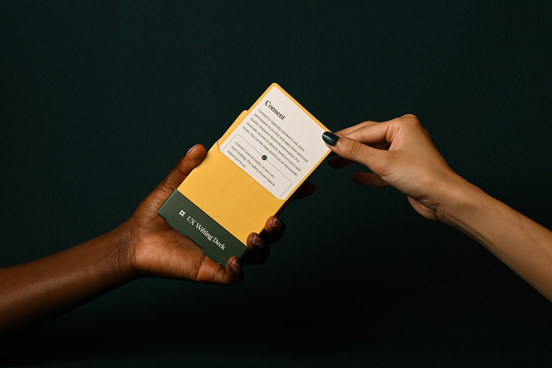
Photo Credit: Ruixin Tian
Tools
Photoshop, InDesign, Illustrator, Webflow, Figma
Deliverables
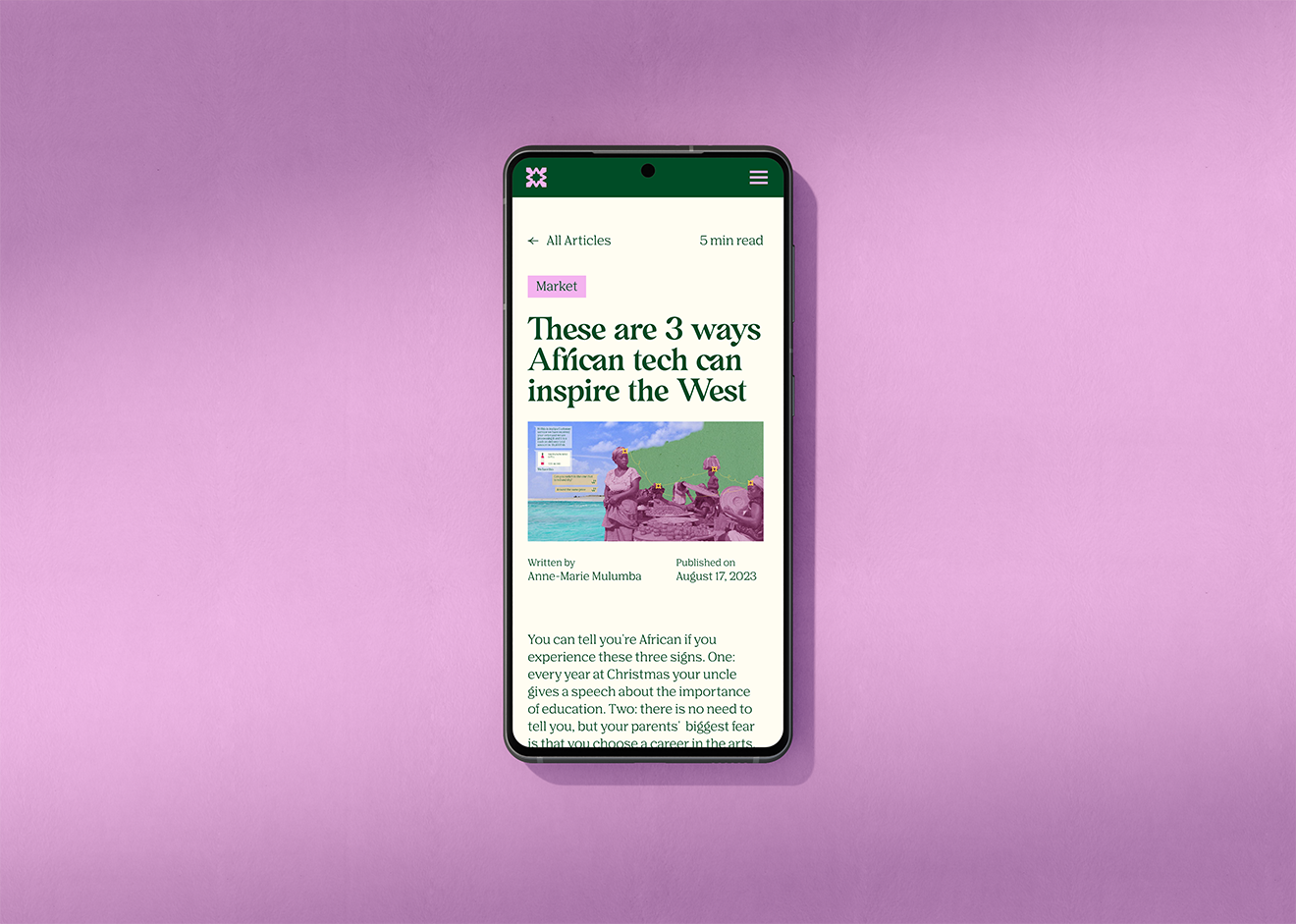
Brand Identity System, Print Collateral, Packaging, Web Design & Development.
Keywords
Knowledgeable, Polished, Inviting
Year
2023-2025
The Challenge
SaaS branding tends to lean cold — techy, minimal, impersonal. Wabala needed the opposite: a visual identity that felt warm and collaborative while still being credible enough to sit in front of enterprise clients. The challenge was humanizing a consultancy in an industry that rarely does.
The Process
The project began with a brand and visual audit, followed by stylescape presentations and brand identity workshops with the founder. Before finalising any direction, we validated the identity against its intended audience: established founders leading venture-backed SaaS companies who expected polish and credibility from day one.
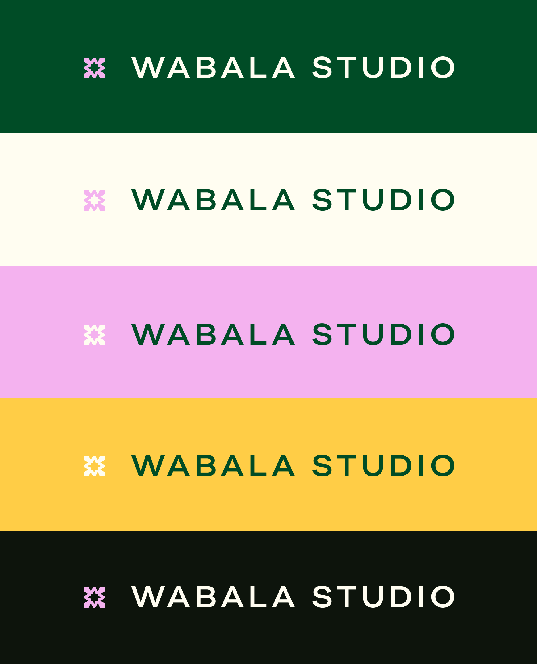
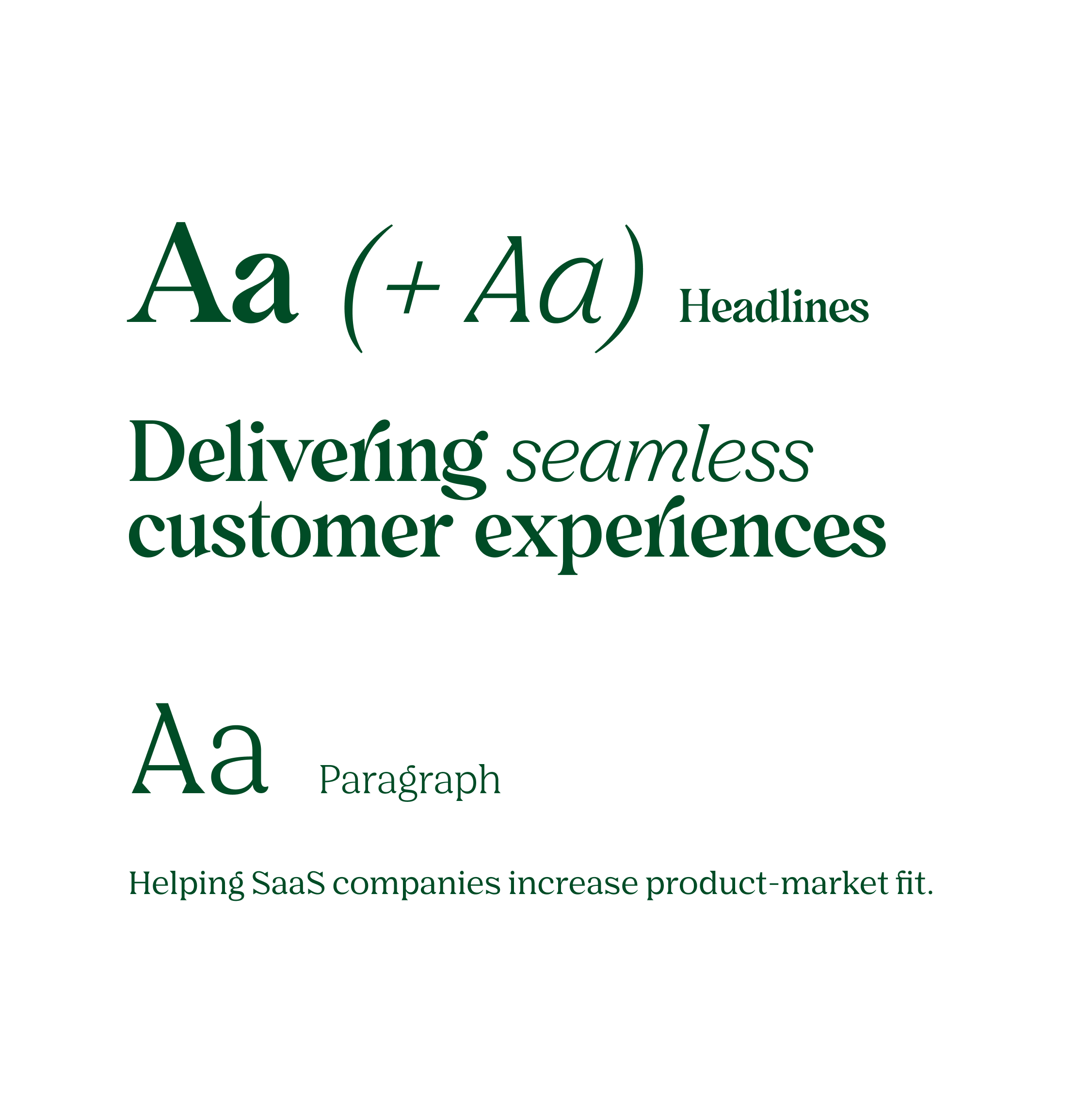
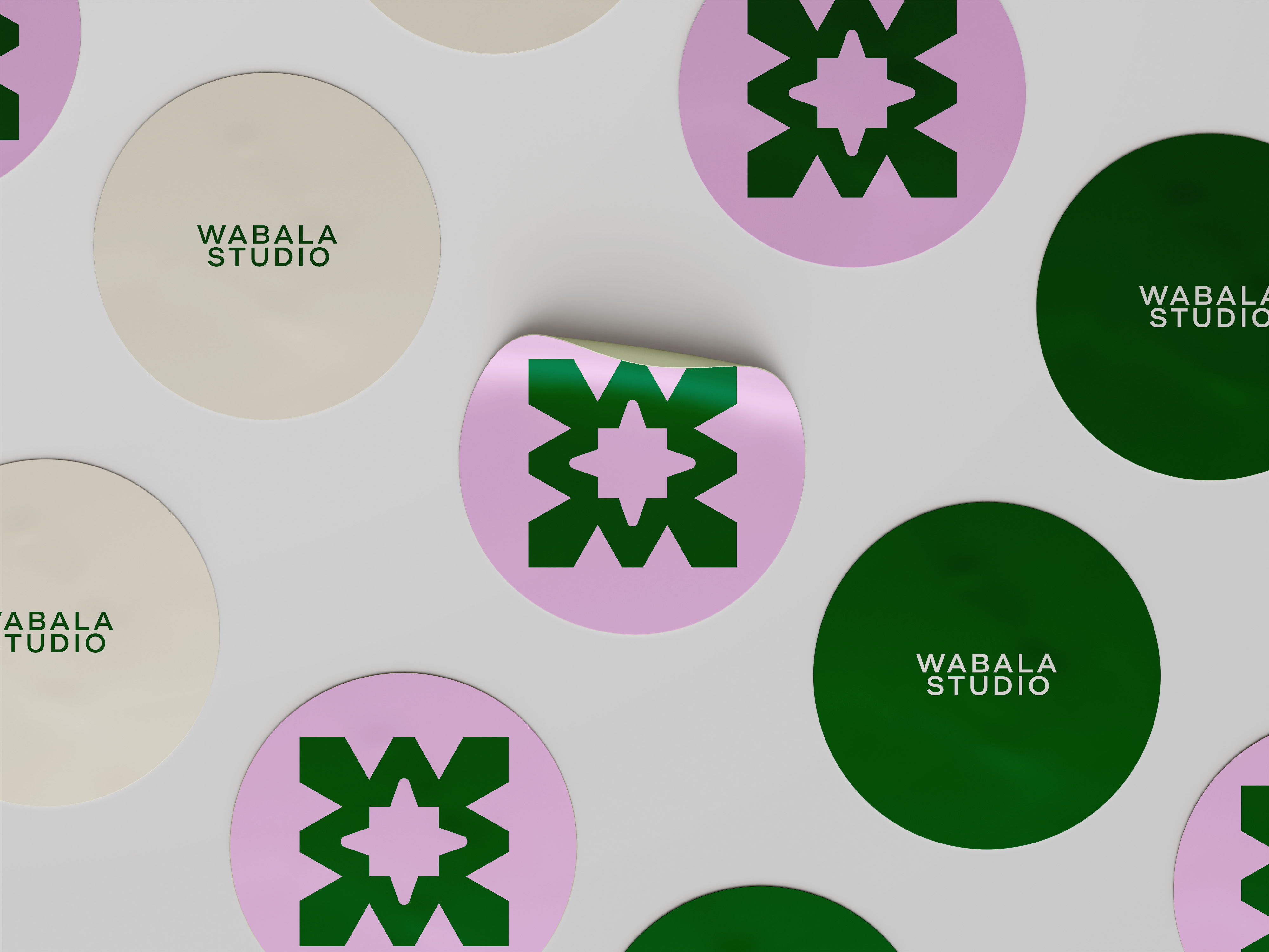
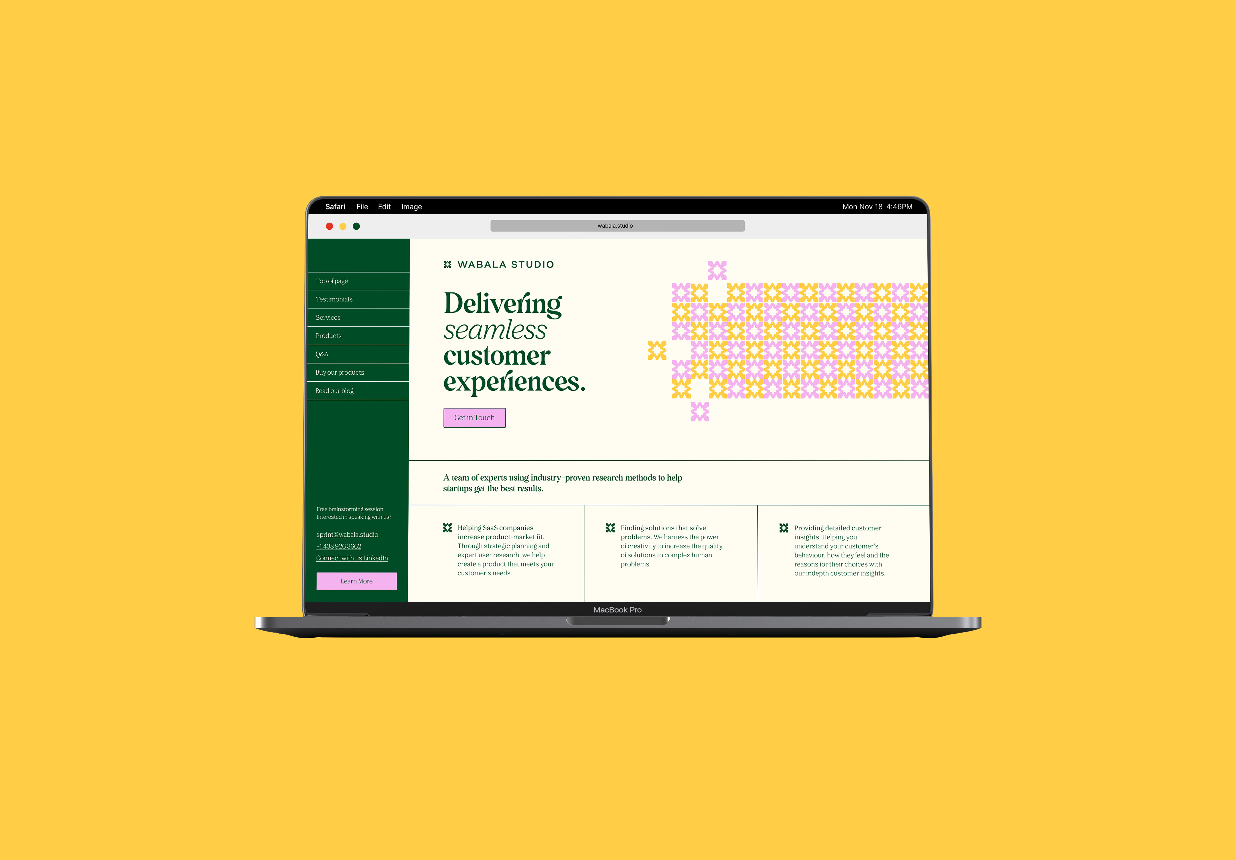
The visual language moved deliberately away from SaaS conventions — no gradients, no abstract tech shapes — landing instead on a minimal but colorful aesthetic rooted in brutalist graphic design. The studio icon is drawn from the letter W in Wabala, its form echoing East African mosaic tiles that held personal meaning for the founder.

Logo Evolution
The Solution
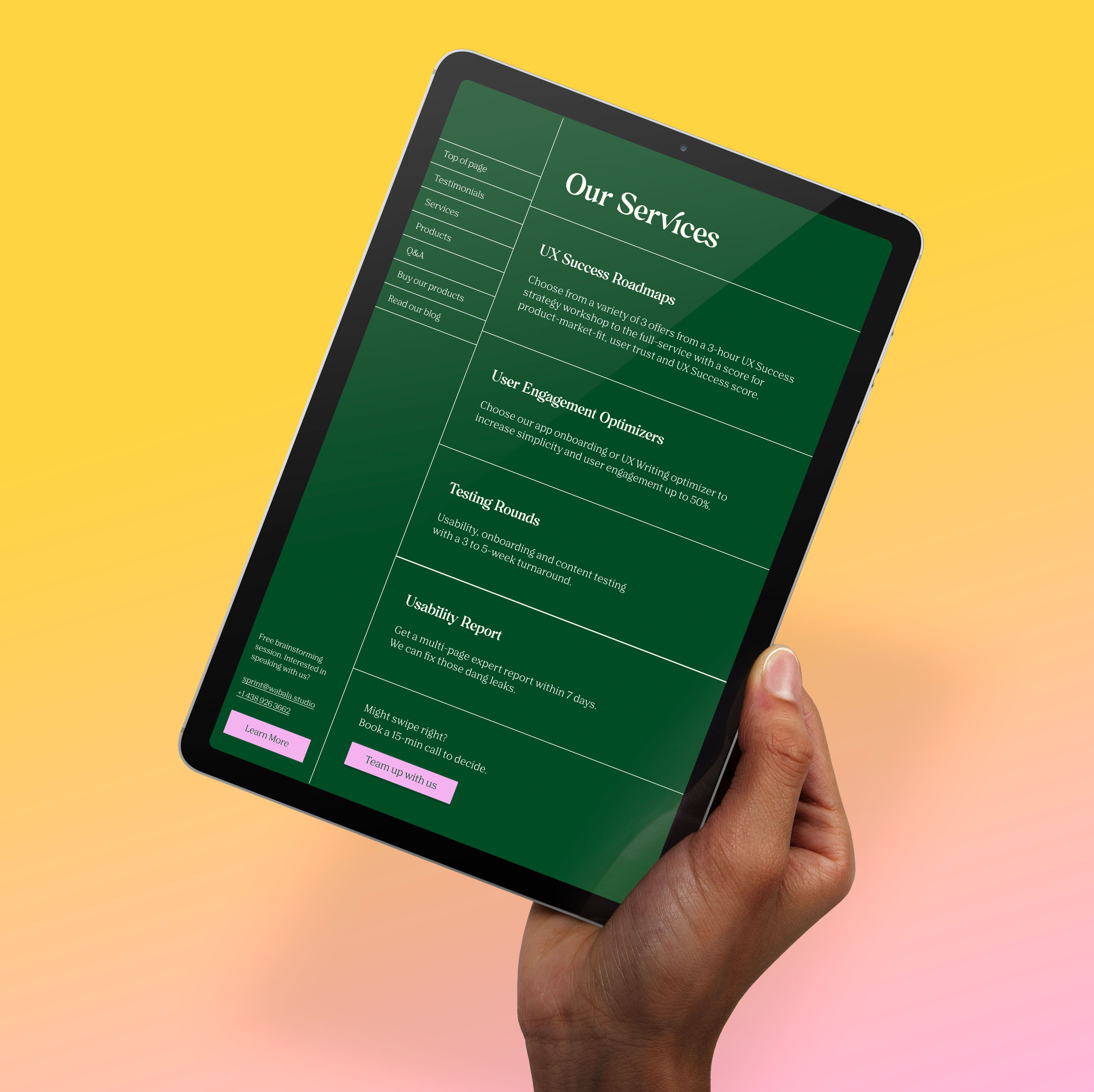
The resulting identity system is built around a signature Wabala green anchored by a clean typographic pairing that balances warmth with authority. Every touchpoint, from logo to layout, reinforces the studio's core positioning: rigorous thinking, made approachable.
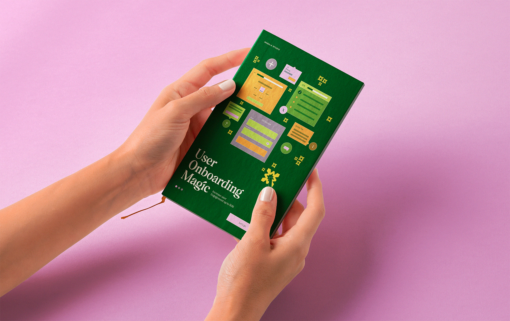
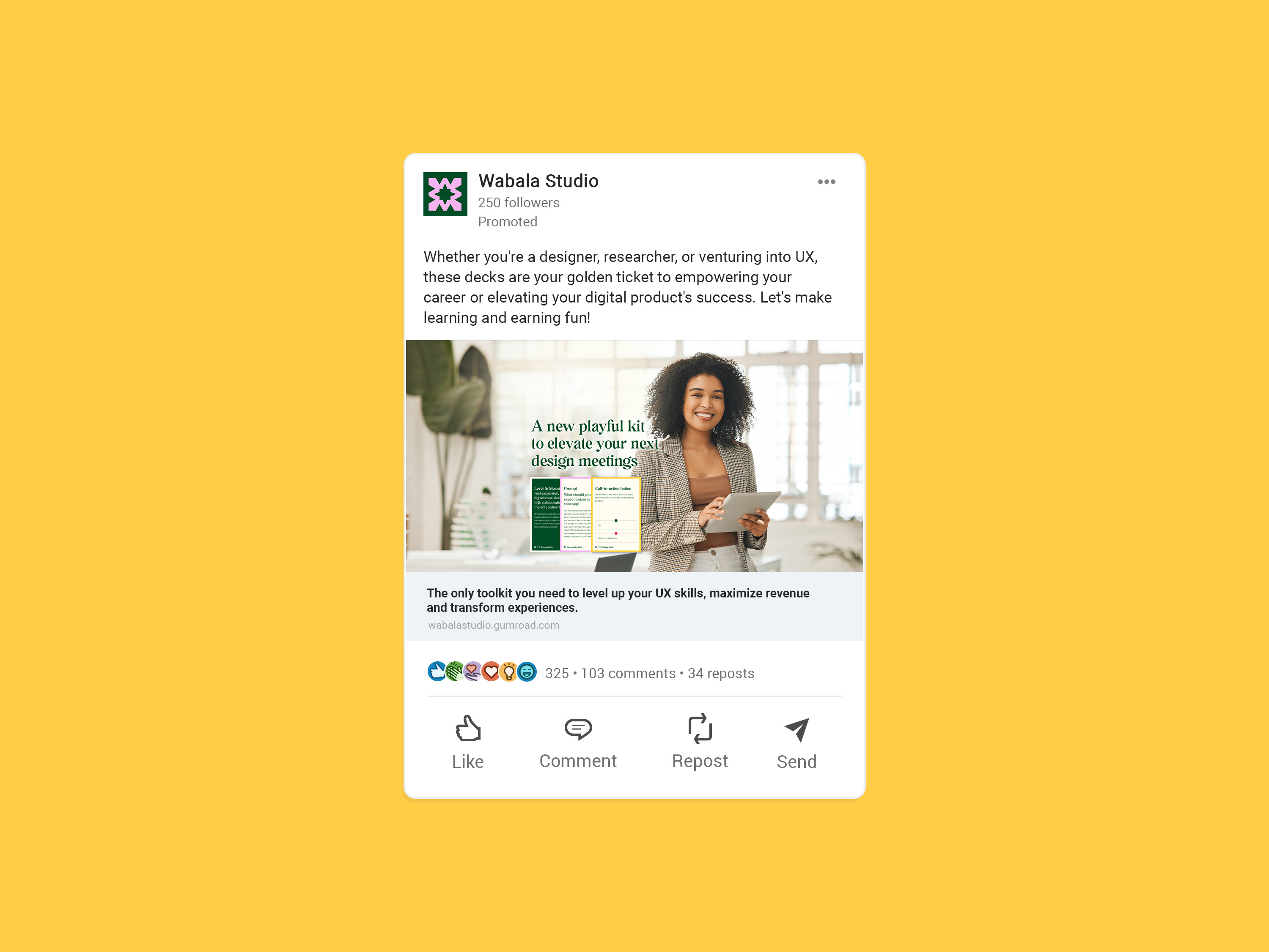
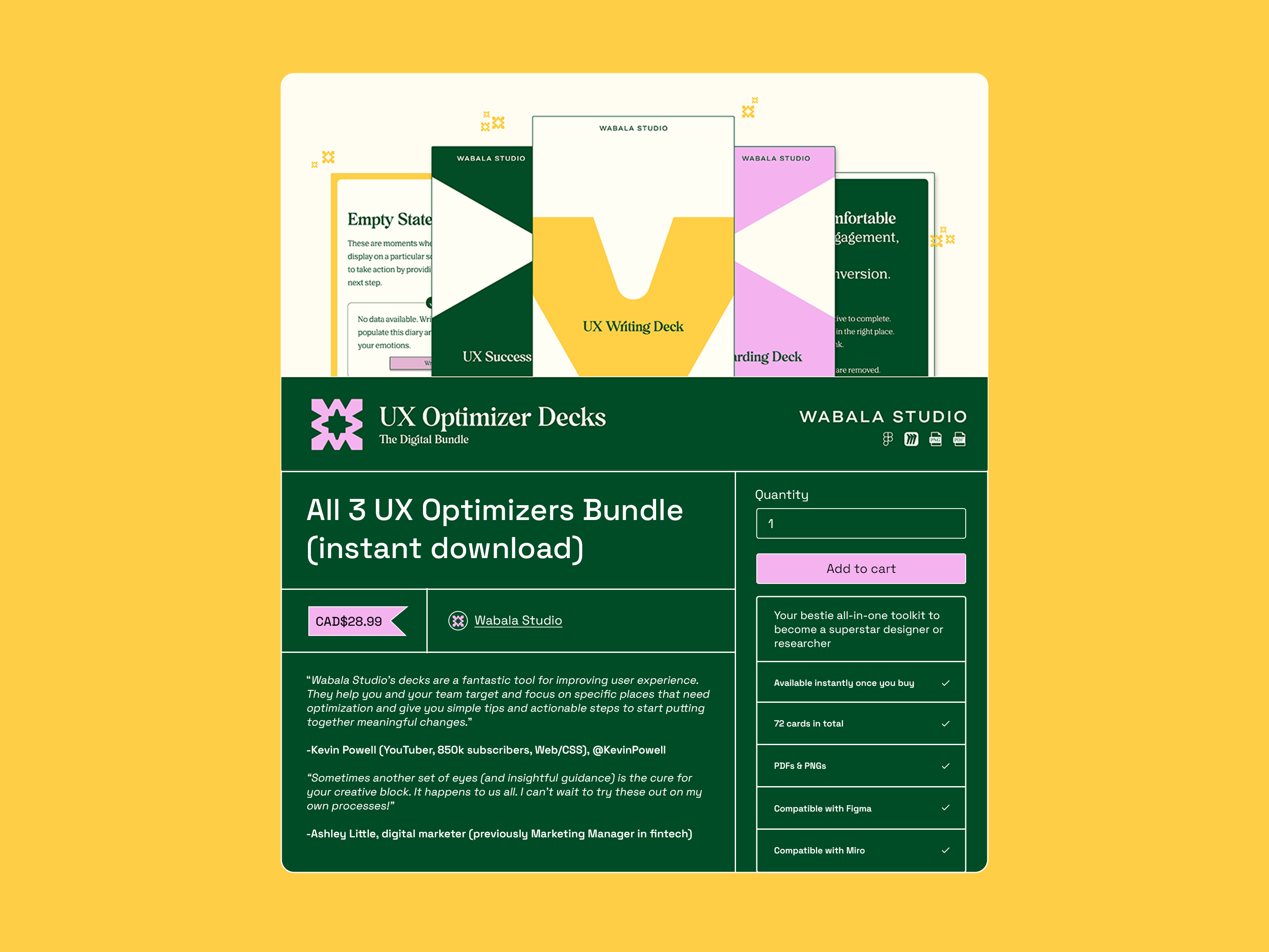
One standout deliverable was a deck of cards designed to support the founder's UX workshops and serve as a product for her audience. Across three series, each representing a distinct phase of the UX process, individual brand colors differentiate the decks while the Wabala green ties the system together. Custom packaging was developed in collaboration with a packaging designer and prepared for commercial print.
-optimized.png)
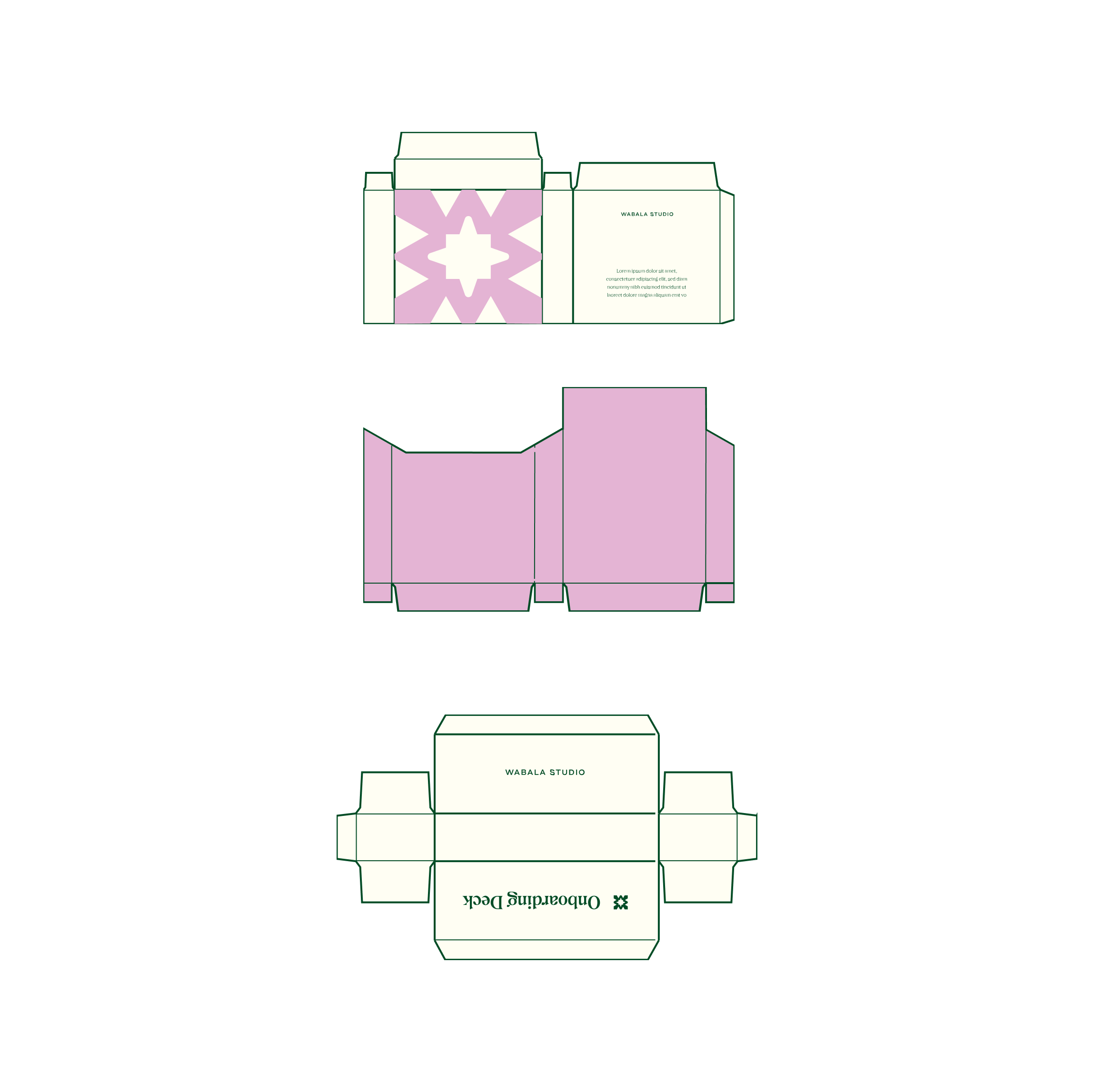
Photo Credit: Ruixin Tian
Initial Packaging Design Draft
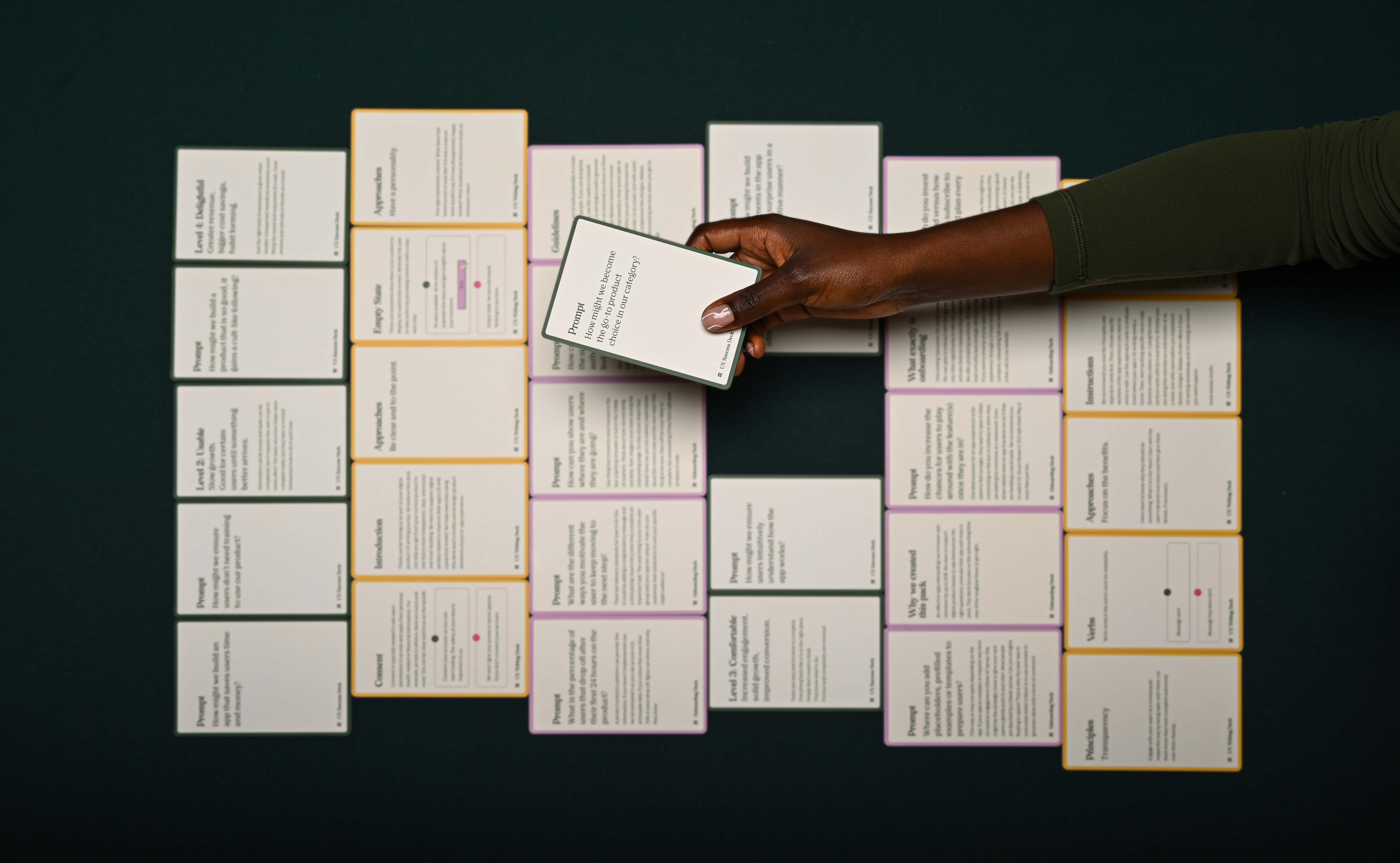
Photo Credit: Ruixin Tian
The Reflection
This project worked because the timeline allowed for real depth — workshops, research, iteration.
Wabala Studio was my first major project as both brand and web designer, and it stretched me in every direction: logo, typography, print, packaging, and a full Webflow build, all from scratch. Learning Webflow on the job and collaborating under a packaging designer gave me hands-on experience I couldn't have gotten any other way. Everything here is custom, and that process solidified something for me: I love design regardless of the medium.
The card decks went on to become a finalist for Best Packaging Design at Gala Gutenberg.
What made this project especially rewarding was the relationship. As a longest-standing clients, I was genuinely on board with wherever her ideas led. That kind of collaboration is what the best projects are built on.